The Future of Computer User Interface is Physics Based
In the early '70s the research lab of Xerox at Palo Alto has developed the so called "WIMP user interface": Windows, Icons, Menu and Pointer. It took almost 15 years until Apple started to integrate such functionalities in the first Macintosh, and couple of years later Microsoft's Windows started to use the same metaphors.
Today's operating systems still use the same GUI which is based on the ideas already available in the '90s. But computer resources are growing exponentially -- couldn't we use this extra computing power for a better desktop experience? We could. The following projects are such initiatives, and their eye candy demo videos are definitely worth watching.
XGL for Linux
Novell started a project called XGL in late 2004. Their goal is to create an X server architecture for Linux, which allows fancier, more intuitive user interaction. XGL puts different desktops on the sides of a cube. Switching between the desktop happens through rotating this cube. The other features stay in the realm of 2D, but include nice effects: windows deform like jelly rectangles when one moves them around; transparency of windows can be fine-tuned, etc. Check out this video for a short demo, or burn a kororaa live CD to try it out yourself. Now, XGL does not bring revolutionary things, but it enhances current GUI which starts to behave much more physics based, and it is a bit less abstract.
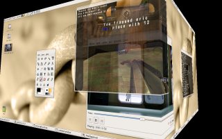 Click here to view the XGL demo video
Project Looking Glass
A similar project was started by Sun, as well. Not surprisingly, Project Looking Glass is based on Java Technology, and its aim is to enrich the desktop experience with 3D elements. One can, for example, tilt windows and put them on the side. A neat function is that one can turn around windows and attach notes to the back. Some other features include: a jukebox-like music browser, control over the translucency of windows. You can view the video of Jonathan Schwartz presenting a short demo of Project Looking Glass here. Again, we did not see fundamental innovations how we interact with the computer, but mostly neat enhancements were introduced to improve the user experience.
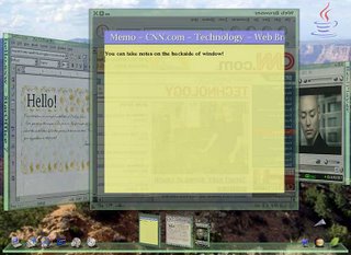 Click here to view the Looking Glass demo video
BumpTop - real physics
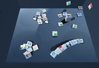
Research communities strive to reinvent the way people interact with computers, as well. Anand Agarawala from the University of Toronto's Dynamic Graphics Project had a really cool master's project: BumpTop. He created a 3D computer desktop using a real physics engine, AGEIA PhysX SDK. Anand thinks the computer desktop should simulate the real desktop as well as possible, and he goes as far as trying to simulate even the untidiness of a real desktop. Of course, BumpTop supports a lot of smart functions: One can drag, throw around icons which collide and behave exactly as one expects in real life. After organizing icons into piles you can lay them on a regular grid, browse through them with a fisheye function or leaf through the pile exactly like you would with a real life book. Dozens of other functions are available, but what is the most important is that all of them resemble to real-life manipulations. He has a very thorough video presenting the features of BumpTop. Moreover, according to his website, he is planning to build a full blown desktop replacement that can be installed on any machine.
 Click here to view the BumpTop demo video
But it does not take teams of research and state-of-the art physics engines to enrich the desktop environment. Kristian Høgsberg implemented a small and simple physics engine, Akamaru and created a physics based Mac OS X-like dock for Gnome. This short video demonstrates what a single programmer can do with a bit of programming time invested.
Conclusions
All the projects presented above have at least one thing in common: physics simulations. They use simulation of real-life world in order to bring something to the user which is less abstract and it is closer to the world we are used to.
The question is: Will users the users accept it? Innovating user interfaces is not an easy task. Users don't want to learn a lot of new things in order to use the computer, so there will be always a resistance toward new GUIs. One way to go around this problem is by not making drastic changes (like XGL and Project Glass), thus allowing an easier transition. Microsoft has learned this the hard way, through Microsoft Bob. So, this time the Redmond-based company takes smaller steps with the upcoming Vista operating system: Windows Aero. According to this demo video, they introduce smooth transitions, improved switching between windows, but nothing too radical.
Even if one makes a bigger leap (like BumpTop) the first and foremost criteria for success is that the new system should offer improved usability. Joel Spolsky defined usability in a single sentence: Something is usable if it behaves exactly as expected. But what could look more natural than the physics of the world we live in? So, if we accept this definition, these projects are definitely on the right track to get closer of tomorrow's mainstream desktop environment. I predict that there is a still long way ahead of us, but maybe in a couple of years Microsoft or Apple makes the step, just like in the '80s Steve Jobs went to Xerox's research center and came back with a new user interface.
---
Thanks to Gabor Cselle for reviewing drafts of this.
Today's operating systems still use the same GUI which is based on the ideas already available in the '90s. But computer resources are growing exponentially -- couldn't we use this extra computing power for a better desktop experience? We could. The following projects are such initiatives, and their eye candy demo videos are definitely worth watching.
XGL for Linux
Novell started a project called XGL in late 2004. Their goal is to create an X server architecture for Linux, which allows fancier, more intuitive user interaction. XGL puts different desktops on the sides of a cube. Switching between the desktop happens through rotating this cube. The other features stay in the realm of 2D, but include nice effects: windows deform like jelly rectangles when one moves them around; transparency of windows can be fine-tuned, etc. Check out this video for a short demo, or burn a kororaa live CD to try it out yourself. Now, XGL does not bring revolutionary things, but it enhances current GUI which starts to behave much more physics based, and it is a bit less abstract.
 Click here to view the XGL demo video
Project Looking Glass
A similar project was started by Sun, as well. Not surprisingly, Project Looking Glass is based on Java Technology, and its aim is to enrich the desktop experience with 3D elements. One can, for example, tilt windows and put them on the side. A neat function is that one can turn around windows and attach notes to the back. Some other features include: a jukebox-like music browser, control over the translucency of windows. You can view the video of Jonathan Schwartz presenting a short demo of Project Looking Glass here. Again, we did not see fundamental innovations how we interact with the computer, but mostly neat enhancements were introduced to improve the user experience.
 Click here to view the Looking Glass demo video
BumpTop - real physics
Research communities strive to reinvent the way people interact with computers, as well. Anand Agarawala from the University of Toronto's Dynamic Graphics Project had a really cool master's project: BumpTop. He created a 3D computer desktop using a real physics engine, AGEIA PhysX SDK. Anand thinks the computer desktop should simulate the real desktop as well as possible, and he goes as far as trying to simulate even the untidiness of a real desktop. Of course, BumpTop supports a lot of smart functions: One can drag, throw around icons which collide and behave exactly as one expects in real life. After organizing icons into piles you can lay them on a regular grid, browse through them with a fisheye function or leaf through the pile exactly like you would with a real life book. Dozens of other functions are available, but what is the most important is that all of them resemble to real-life manipulations. He has a very thorough video presenting the features of BumpTop. Moreover, according to his website, he is planning to build a full blown desktop replacement that can be installed on any machine.
 Click here to view the BumpTop demo video
But it does not take teams of research and state-of-the art physics engines to enrich the desktop environment. Kristian Høgsberg implemented a small and simple physics engine, Akamaru and created a physics based Mac OS X-like dock for Gnome. This short video demonstrates what a single programmer can do with a bit of programming time invested.
Conclusions
All the projects presented above have at least one thing in common: physics simulations. They use simulation of real-life world in order to bring something to the user which is less abstract and it is closer to the world we are used to.
The question is: Will users the users accept it? Innovating user interfaces is not an easy task. Users don't want to learn a lot of new things in order to use the computer, so there will be always a resistance toward new GUIs. One way to go around this problem is by not making drastic changes (like XGL and Project Glass), thus allowing an easier transition. Microsoft has learned this the hard way, through Microsoft Bob. So, this time the Redmond-based company takes smaller steps with the upcoming Vista operating system: Windows Aero. According to this demo video, they introduce smooth transitions, improved switching between windows, but nothing too radical.
Even if one makes a bigger leap (like BumpTop) the first and foremost criteria for success is that the new system should offer improved usability. Joel Spolsky defined usability in a single sentence: Something is usable if it behaves exactly as expected. But what could look more natural than the physics of the world we live in? So, if we accept this definition, these projects are definitely on the right track to get closer of tomorrow's mainstream desktop environment. I predict that there is a still long way ahead of us, but maybe in a couple of years Microsoft or Apple makes the step, just like in the '80s Steve Jobs went to Xerox's research center and came back with a new user interface.
---
Thanks to Gabor Cselle for reviewing drafts of this.

